If anyone is interested in testing dark mode for the main site, let me know your username here. It’s almost ready, but a few areas still need some polish. Any feedback you can provide would be great.

If anyone is interested in testing dark mode for the main site, let me know your username here. It’s almost ready, but a few areas still need some polish. Any feedback you can provide would be great.
Would be happy to give this a go 
I use dark mode on all sites. I would like to test it too. (ereezi)
me! i love dark mode… my user is aristocat
Would you please give me access to dark mode? Thanks! (SirTristan)
Some quick feedback: dark mode is great, generally. A few spaces are unreadable bc the light colour still appears behind white writing (i.e. names of already existing albums by an artist when you’re adding a new one; the file-name box when you upload cover art). The green text that comes up when you’ve successfully submitted a track-listing is also quite hard to read. Hope this helps.
it’s perfect for a demo! it’s very beautiful. but i experienced the same issues as @QueenOfDenmark. but generally it’s perfect! thank you <3
Hi Rob,
If you need more testing, I’d be happy to help.
Yeah, I’m interested!  It’s Tilathiel, just like here.
Orangedroog65 set me up!!!
Can I revert to ‘light’ for the time being? Happy to switch back as and when further demo’ing needs doing
I’d be up for it! My main site name is Jamobo
would love to help and be a part of this. my name on the main site is cummerbummer
username: aaron
Everything looks great except this area, the white lines need to be changed to grey or something 
And the letters for follow should be a different colour.
Would love to test it mate.
User: GalaxyStrider
I’m adding pics so it will be much easier to understand what I mean. Also, wherever it was possible, I added my suggestions on these screenshots.
Search bar is kinda off, it has these white pixels around it. pic
I think colors for ratings should be darker, so it fits better to the color scheme.
“Become a Donor” button should be darker. pic
Tags and buttons should be darker. pic
I think the buttons on the bottom should be darker. pic
Line under shoutbox is too bright. pic
The very bottom should be darker. pic
When it comes to list page, albums added have that bright background. Also, text on this page is the same color as the background, making it unreadable. pic
When commenting settings are shown, the background is definitely too bright, and the text without linking is light-colored, making it hard to read. pic
In followers/following/blocked list, the separating lines are too bright. Basically the same situation as above.
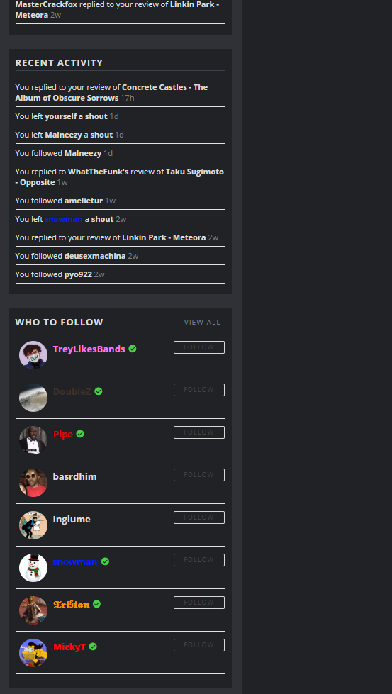
Notifications, recent activity and “who to follow” have these separating lines too bright. Buttons are off, too. pic
“Recent review comments” list on user profiles has dark text, and the bottom lines are too bright. pic
“Recent album discussion” list on user profiles has partially dark text. pic
In settings, “about you” typing text is black. pic
“Donors only” in settings has too dark text. pic
Donate page has bright boxes. pic
Critic reviews in their scores have too light background. pic
“No photo” and placeholder for album cover is too bright. pic
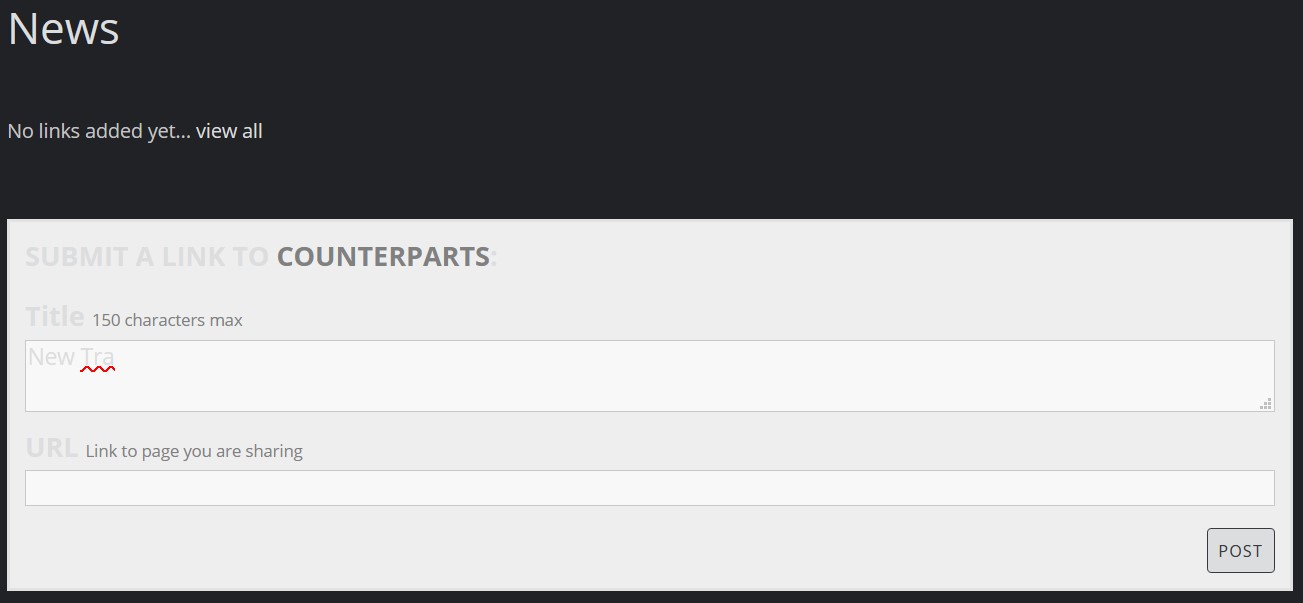
When I want to add a release, the box’s border and “currently added albums” table is bright. pic
When adding track list, I think examples are too dark. pic
In user profiles, when I hover over links in “recent reviews”, they are gray for artist name and black for album title.
Oh, and it’s not about the main site, but the forum: I use dark mode here, too, and for some reason two logos are being displayed! pic
Catched another four!
Would love to test Dark Mode. U: eastbaldboy