In MIcrosft Edge
logo see in low resolution

In MIcrosft Edge
logo see in low resolution
I’m using the Firefox (56.0.2).
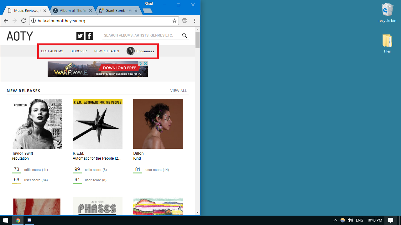
So… this may be a dumb question but am I correct in assuming that this design is made primary for mobile? I’m asking because I think the new design looks incredible on mobile devices but the removal of the black navigation bar and side padding hampers the flow on a desktop; both the nav bar and padding gave the layout some breathing room and with their absence the site feels claustrophobic—I mean, for me anyway, I’m weird.—and moving those heavy traffic links to a drop-down adds one more needless click for users.
Mobile definitely received a larger portion of my attention during the redesign, but this was mainly due to having to update the pretty bare bones mobile site we have now.
On desktop, I did go wider than most sites. It did take me awhile to be totally comfortable with it, but it does feel normal to me now. What resolution are you using? I’ll see if I can adjust the padding some without hampering what’s being displayed.
My monitor died last week so I’ve been using my 19 inch TV; just viewing in 720p so nothing crazy. I’m just a nit picky boy who dislikes change—plus I have a poor disposition towards fluid design from pulling out my hair trying to design them in college.
Anyway, here’s a few more problems I encountered:
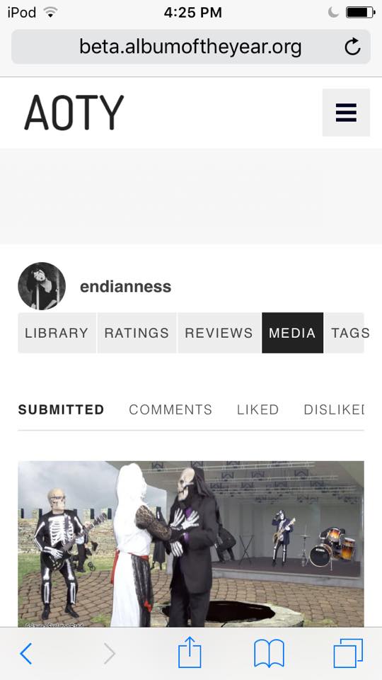
Tag link overlapping.
On IOS (Safari) the bar at the bottom blocks the community link; when scrolling it will only appear if you lift your finger afterwards. Search bar and drop-down icon scroll up too which leaves an awkward blank space.
Is this on every page? Could you try refreshing to make sure you have the latest .css file loaded? I can’t seem to replicate this.
I reset Safari’s cache and tried logging it; got this bad boy:
Facebook crashed when trying to log-in, so that’s probably what happened.
Are you stuck with that now, or can you get past it?
I think I fixed the issue of not being able to access all of the menu. You should be able to scroll through it now. I’ll work on a fix for the search bar staying fixed. I think I intentionally had it disappear like that for some reason.
Yeah, I had no issue logging back in.
Bingo! Scrolling is working perfectly now.
When viewing a page of an album you’ve reviewed in portrait mode the edit review link becomes offset.
When viewing a profile landing page the navigation bar disappears while in portrait mode.
You’re on the one resolution I didn’t test out 
I’ll get these fixed tomorrow.
The nav bar on the profile page was intentionally left off, but everything should still be reachable from that page (minus tags for right now). Let me know if you still think this is confusing, but I couldn’t find a way to make a nav bar look nice while containing links to every user category.
I was wondering if it was left out intentionally because I don’t even know where it would fit in.
I think I have all of the fixes patton and endianness suggested completed (except for the Add Cover page). Let me know if you’re still having issues with any of these.
Artist links in the “You May Also Like” section of an album page are broken.
Found this while playing with the window size on desktop.
I think I’m going to launch the new design tomorrow night. Let me know if you find any last minute issues.
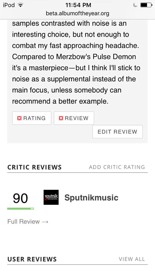
Is there a quick way to access ratings on a album page besides: User Reviews > Ratings?
Links cutting off:
That’s the only way right now. Any suggestions on how to make it easier?
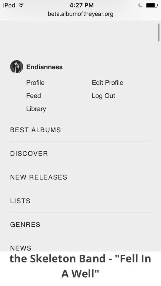
I couldn’t think of a better way to handle the navigation on narrower viewports than that. I do think LISTS should be added though, which would then take care of every major section of the site.