Social medias “steal” designs/features from other apps/sites all the time, so why not AOTY??
Letterboxd has clearly been the go-to for movie ratings, reviews, and tracking what you’ve watched, and AOTY has the potential to be the same thing for music. I’ve been an avid user of AOTY for 3 years now, and in those 3 years, there’e been little in the way of change or improvement, and in the past week I’ve honestly found myself on Letterboxd more and more, fantasizing about some of their features making their way to AOTY.
-
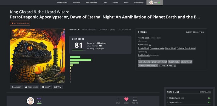
First and foremost: Letterboxd is entirely user based. AOTY has gotten more popular over time, and should begin focusing more-so on the users and their scores, giving less focus/attention to critics (especially since critics and users almost never see eye-to-eye on albums). Whether this means just moving Critic scores to the side, making the default Must Hear the user one, or maybe incorporating the critic avrg into the album info box on the right side of the album page… simply put, prioritize users and their opinions, and sideline critics without completely getting rid of them.
-
“Offical” Lists (see Letterboxd’s Top 250 Narrative Films list) - a Top 250 Full Length Albums list would be cool to see, with some fine tuned filters missing from our current go-to “Best Albums of All Time” (via User Score). Filter’s such as LPs only, cutting out Live album’s EPs, soundtracks. Also 1000+ user scores. Then an idea to steal from RYM, wherever [blank] album ends up on this Official List, it’s placement should be noted on the album’s page. Letterboxd also has multiple Official lists run by their crew, so official lists such as Top 50 Soundtracks, Top 100 Hip-Hop etc. etc. would be cool to see.
-
The ability to have recorded an album as “listened” without having to rate it.
-
A Diary. Letterboxd’s diary is based off logged films and when you watched it. Obviously music is a different medium consumed differently, but a diary for “first listens” would be super cool, as well as the ability to log a first listen in retrospect, choosing the date in which the first listen took place.
-
More indepth stats, as currently they are BORE-ING (but perhaps just give this to Donors, as Letterboxd’s stats are only available to Pro users). Stats like, number of albums/projects logged or rated from x year (image below), average rating per year/decade, artists ranked by your average score of their projects, or a sight map of which countries we have the most albums from… just more than what our stats currently tell us.
-
A “Watchlist” equivalent. A Listenlist? Just an all encompassing list for upcoming releases, releases stuck in your back log, and basically anything we still want to listen to–also accessible from the profile, as to not take up space in our lists.
-
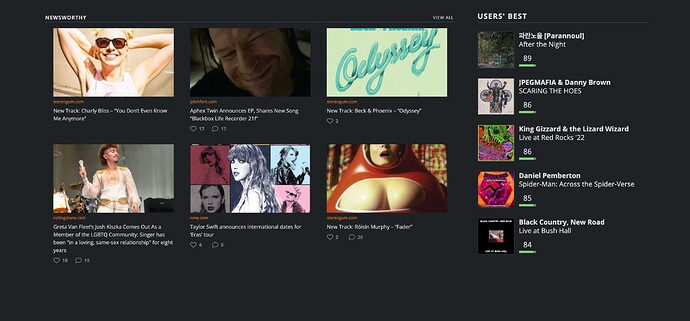
Perhaps a reach, but, make the site a tad more compact. Letterboxd’s design is NICEEEE, but also compact. AOTY is basically taking up the whole screen, with a design that becomes more outdated with each passing month. And with being an ad-free donor, there’s a lot of empty and wasted space on the home page. Use it. A mockup of using empty space:
-
Then last reach… an AOTY staff or crew. Can run official lists, help with bots and score manipulation. Authorizing tracks scores or album corrections, etc.
Then, some non-Letterboxd ideas:
- The ability to pin up to 2 lists
- Tagging lists
- Let’s just get rid of Recently Added at the bottom of the home page. Who pays attention to that?
- The “On This Day” is so weird. Only ever showing 1-2 albums, weirdly formatted, while when you click See All, there are far more than just 1-2 albums released On This Day. Show the top 5 by average user score
- Move Popular Now to the top, above New Releases. Popular now is almost always at least 3/5 albums found in New Releases. Soooo, any album that would make it into New Releases BUT is ALSO in Popular Now, pull them out of New Releases to avoid redundancy, but also to promoted a total of 15 albums at all times.
- Somehow incorporating our Last.fm data into our profiles, ie. Most Listened Albums ???


