Benny

Benny
Maybe there could be a more appealing appearance to lists in Dark Mode … ?
It’s not necessarily an error, but I guess we’re aiming to make this dark theme an “evil twin” of light theme, so there’s certainly a little piece of code to be changed. Inner and outer background colors are the same, while in light mode they aren’t, so my suggestion is to change #202225 to #181a1c in #centerContent.
I’d be glad to try it out
The only problem that I run into is text not being the right color so it blends into the background.
it would be nice to change these colors
Just turned this on. I like it and it all looks good at first glance. Will be back if anything arises.
Ive been using it for about a week and I love it! My only problem is that when you edit reviews the text in the box is a light grey instead of white and its really hard to read
I agree with zn0rth3. I’ve been having the same issue.
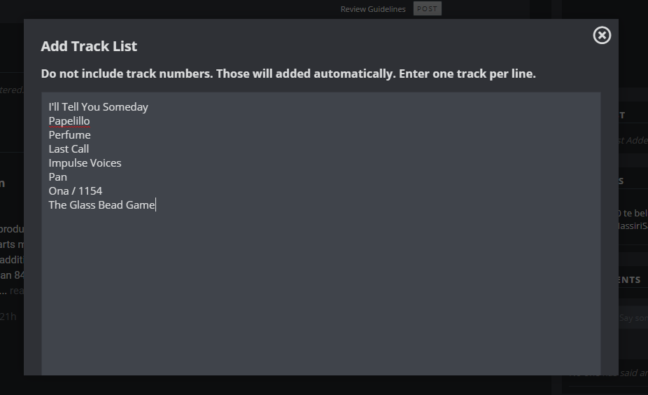
I don’t know if this is a problem specific to Dark Mode or just the site in general, but every time i try to submit a tracklisting the submit button isn’t immediately accessible:
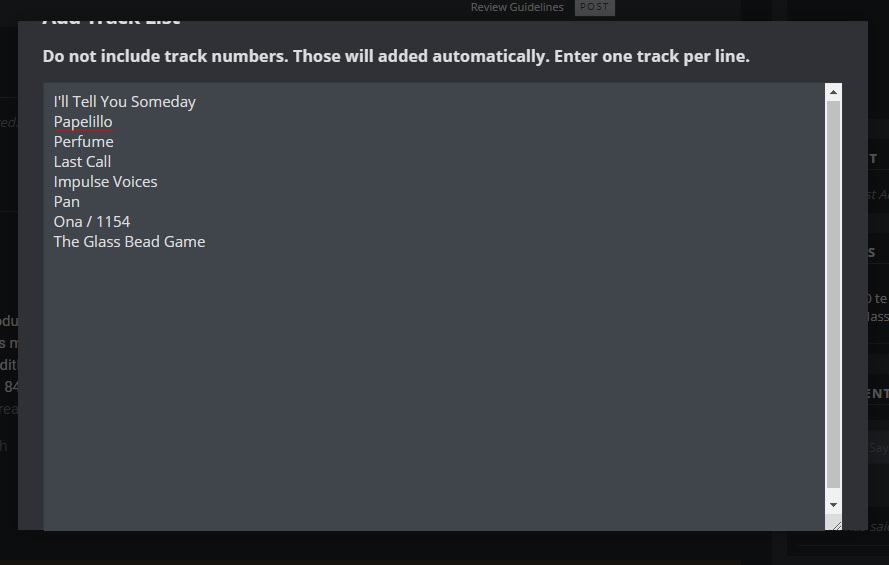
To get to the button i have to create a bunch of lines so that the scroll bar appears:
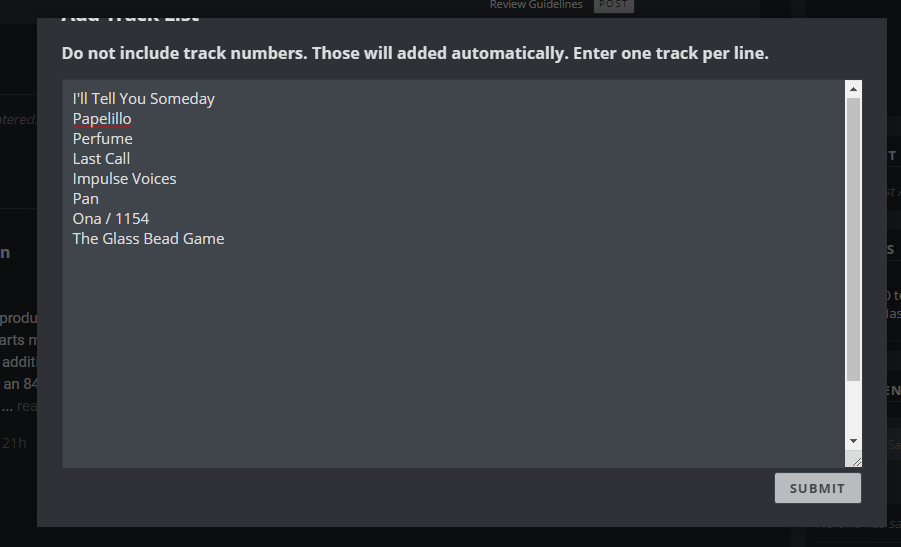
Then i can drag things up using the tool just beneath the lower arrow:
Hopefully this can get fixed, until i found this out i had to stop creating track lists multiple times and i’m others have probably been put off too.
Hi Rob, I tried dark mode. Overall auccessful, well done! However I would suggest to use always white fonts because both green and grey colours are not easily readable (or maybe I should wear more powerful glasses). In any case feel free to contact me for future feedbacks 
The dark mode looks pretty good & awesome experience me.
Some of the text is a bit hard to read, particularly in the user stats like ‘most following’ the bars which hold the text for number of followers are white while the actual text is very light gray and almost impossible to make out.
Can it be in accordance with the cellphone setting? Like if the phone is in dark mode so is the site.
its way better than light mode ngl
Mat_Compost.
Really liking it so far, but as someone who has worked in UX and web development, it needs some adjustments. I posted in the general forum about this.