Bump


Bump
I love the look of it, but the notifications on the side are barely readable with that gray color, y’all should make it white
It seems to work great! Only request would be to allow the user to sync the website theme to their system theme (as in the theme of the site should match the user’s system theme, like a similar feature implemented on RYM or Google for example)
Would it still be possible to test the dark mode? If so, I’d fancy it!
My username on the website is the same I have here: pietromagri
Ty!
You should already be able to turn it on in your settings .
dat cool, may i have it?

The font is hard to see
help me out
can i have it? pls.
btw, when a app for a aoty? would be so great

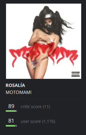
I kinda don’t like how the critics/user score text is dim like this, maybe make it a little bit brighter